
BACKGROUND

Employee travel privileges are one of the main reasons people love working for Alaska Airlines! Employees can fly standby throughout the route network.
The uncertain nature of standby travel (not having a confirmed seat) means employees have different needs than guests and therefore use different tools.
A very fragmented experience in combination with a number of new business initiatives necessitated a redesign for the employee travel website, Fly.
BUSINESS PROBLEM
The day of travel app for employees, Hopper, relies on costly, obsolete software that must be deprecated.
BUSINESS GOALS
💰
Reduce support team costs
The current experience leads to many calls and emails to the employee travel support team
USER PROBLEM
Employees are required to use many different tools on the day of travel, leading to a very fragmented experience
Standby travel can be very unpredictable and stressful. To gather all the information they need, employees juggle many tools on the day of travel, including but not limited to:
Hopper
Employee day of travel app for flight loads, priority lists, booking totals, boarding pass, and alternate flight options

Fly
Employee website used to book flights, manage travel credits, update profile, access travel resources, and get help
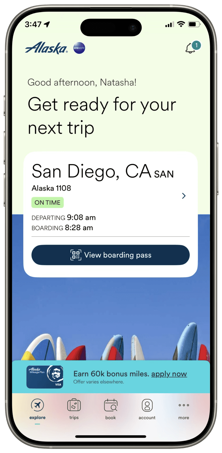
Alaska app
Guest app for check in, boarding pass, and flight information
USER RESEARCH
I identified the following traveler personas, who each have distinct travel needs.


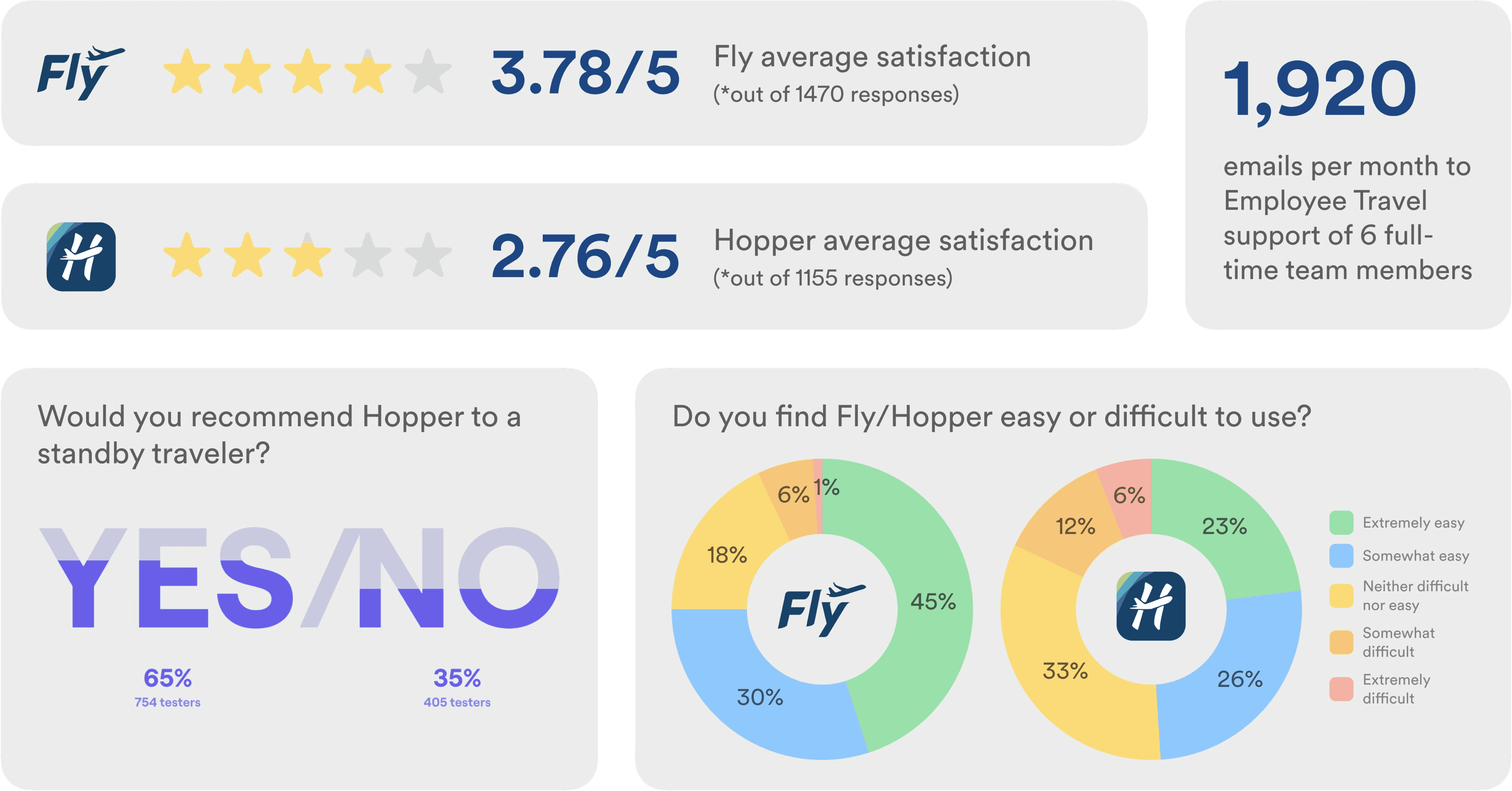
Furthermore, I conducted a survey, competitive analysis with other airlines, hosted a workshop with 14 participants, as well as 9 interviews. This research led me to the following user needs, which guided key design decisions.
Support for each traveler type: commuters, leisure standby travelers, retirees, friends and family members


Survey results revealed low user satisfaction scores and significant resources allocated towards help and support.
TECHNICAL CONSIDERATION
The Fly website is long overdue for a visual refresh and rewrite of old codebases. After discussing with my engineer, we agreed on a strategy to put any new functionality into a new microsite, Fly 2.0, and we would switch between the “old” and “new” sites as seamlessly as possible (with a goal of rebuilding the full site overtime).

OPPORTUNITY
How might we scale the Fly website to consolidate tools, add new travel benefits, and modernize the experience?
NAVIGATION
User research indicated that the current Fly navigation is unintuitive. To set the foundation for Fly 2.0, I conducted a card sort to establish improved navigation. This redesign focuses on three key sections of the site, Trips, Booking + Search Results, and Profile (until the rest of the modernization effort can be completed).


MOBILE NAV / BEFORE & AFTER


USER TESTING
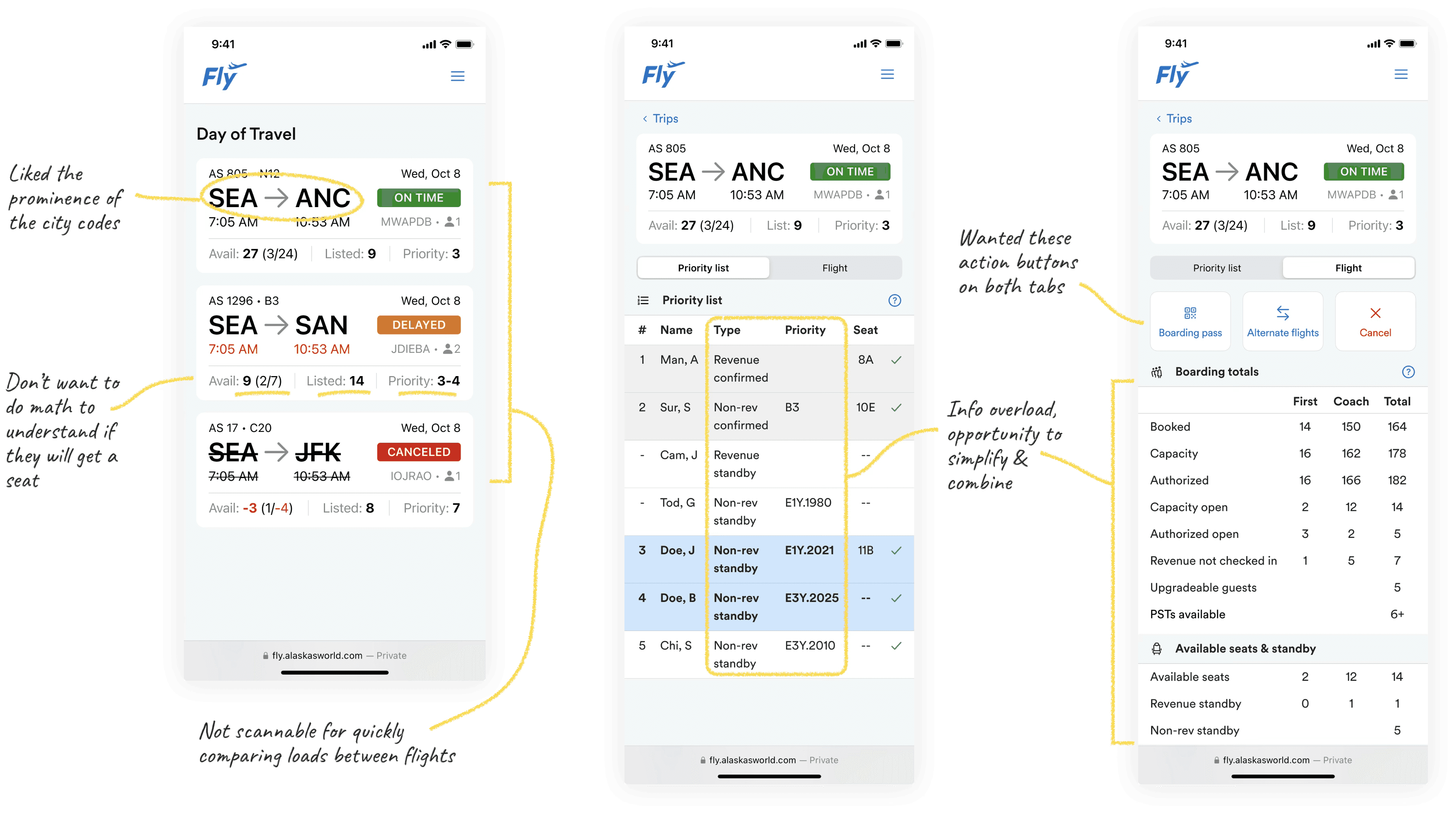
I explored an initial design that consolidated Hopper’s functionality into Fly, creating a unified day-of-travel experience that fits into the Trips page. I validated this direction through 8 usability testing sessions with a range of employee personas, including one of Alaska’s earliest employees, which informed the next iteration.
FINAL DESIGNS
Upcoming Trips
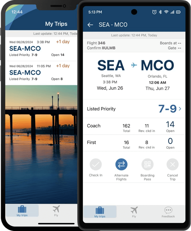
Because day-of-travel usage is primarily on cell phone, the Upcoming Trips experience is optimized for mobile. It mirrors the familiar guest experience, but is tailored accordingly to employee needs. Working within tech constraints and business priorities, the experience seamlessly switches between the legacy and new Fly websites.
DAY OF TRAVEL EXPERIENCE

✈️
Quickly compare loads between flights
⚡️
Dynamic actions when you need them
💺
No mental math needed to calculate chance of getting a seat
📋
The only traveler list you need – no need to switch between tools
❓
Easily find definitions for new or infrequent users
BEFORE (CURRENT FLY + HOPPER APP)


AFTER
This design successfully retired the obsolete Hopper app, while seamlessly bringing necessary day of travel functionality into the modernized Fly 2.0 website.


Book
BEFORE


AFTER
A reimagined a home page that highlights important employee communications and announcements.


Flight Results
BEFORE


AFTER
A modernized flight search results page, with added flexibility via same-screen search and customizable filters.


Profile
BEFORE


AFTER
To support the launch of new travel benefits, Fly needed to support annual benefits enrollment as a prerequisite for rollout. I identified the Profile page as the most intuitive place for this experience and redesigned it to accommodate these new capabilities.

IMPACT
Launched industry-first employee travel benefits, with 76% adoption in the first year
Reduced support inquiries related to annual enrollment, improving satisfaction while lowering costs
Retired legacy systems, reducing risk and saving on development time through modernization and design system adoption
Elevated the employee travel experience to better align with Alaska’s brand
REFLECTION
What I learned
As the first designer this team has ever worked with, I implemented UX collaboration & handoff processes
Tailoring content to an executive audience to convince leadership to invest in employee travel tools
Designing within tech constraints to balance old and new Fly websites
What I would change
Dive deeper into accessibility, especially since this tool is used by every single employee, retiree & their families
Future iterations
Continue modernization of entire Fly 2.0 website
Explore an AI chatbot to further reduce support team calls and emails
